Introduction: Why Mobile Design Matters More Than Ever
If your website isn’t optimized for mobile, you’re already losing business. Over 60% of global web traffic now comes from mobile devices — and Google prioritizes mobile-first indexing. Yet many business owners still confuse mobile-friendly design with mobile-first strategy.
Here’s the truth: A site that merely works on mobile isn’t the same as one built for mobile users from the ground up. Let’s unpack the difference and how choosing the right approach impacts your conversions, SEO, and customer experience.

Understanding the Basics
What is Mobile-Friendly Design?
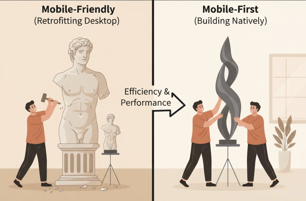
A mobile-friendly website is designed primarily for desktop users but adapts to smaller screens. Think of it as a desktop site that shrinks gracefully to fit smartphones and tablets.
Key Traits of Mobile-Friendly Sites:
- Scaled-down desktop layouts
- Clickable (but sometimes small) buttons
- Minimal text or image adjustments
- Often relies on pinch-and-zoom
It’s functional — but not always ideal.
What is Mobile-First Design?
A mobile-first approach starts with mobile users in mind. The layout, content, and performance are designed for smaller screens first, then expanded for tablets and desktops.
Key Traits of Mobile-First Sites:
- Simple, fast-loading layouts
- Touch-friendly navigation
- Prioritized, concise content
- Optimized images and minimal load times
In short: mobile-first is strategic; mobile-friendly is reactive.
Why the Difference Matters
Designing for mobile-first isn’t just about aesthetics — it’s about conversion strategy. Mobile users behave differently. They have shorter attention spans, expect fast-loading pages, and prefer streamlined journeys.
| Criteria | Mobile-Friendly | Mobile-First |
|---|---|---|
| Design Focus | Desktop, then mobile | Mobile, then desktop |
| Performance | Often slower on phones | Optimized for speed |
| User Experience | Adequate | Exceptional |
| SEO | Can meet minimum requirements | Built to excel under mobile-first indexing |
| Conversions | Often lower | Higher engagement and conversions |
If your mobile experience feels clunky, users will bounce — and Google will notice.
How Mobile-First Design Impacts SEO and Conversions
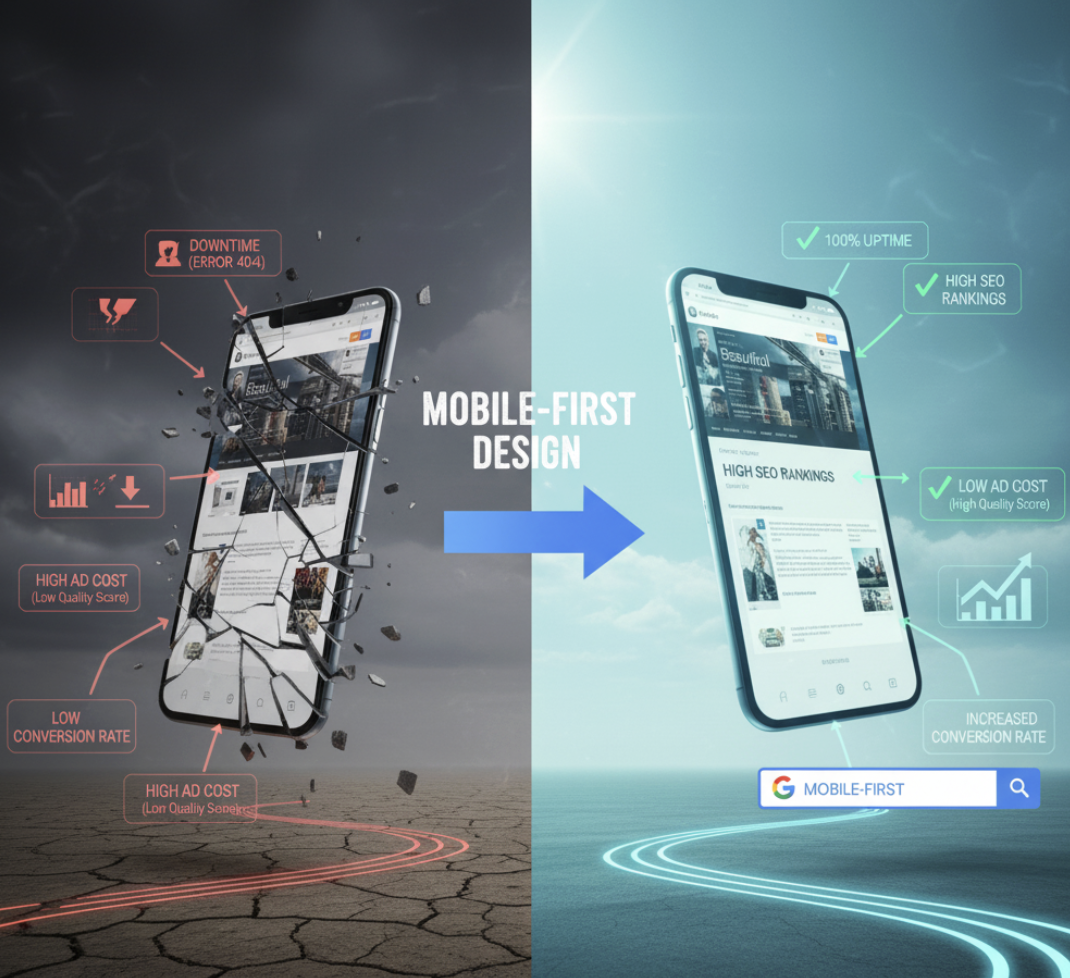
Google has officially adopted mobile-first indexing, meaning it primarily crawls and ranks your mobile site version. That means:
- If your mobile version is slow or incomplete, your rankings suffer.
- A clean, fast mobile experience signals quality and relevance.
Conversion Tip: A well-optimized mobile site can reduce friction, improve lead generation, and even lower ad costs by boosting Quality Scores in Google Ads.
5 Steps to Transition to Mobile-First Design
- Audit Your Current Site
Use Google’s Mobile-Friendly Test and PageSpeed Insights to evaluate mobile performance. - Simplify Your Navigation
Replace complex menus with collapsible ones or icon-based navigation. - Prioritize Speed
Compress images, use lazy loading, and eliminate unnecessary scripts. - Design for Touch, Not Clicks
Make buttons large enough for fingers and spaced apart to prevent errors. - Focus on Core Content
Keep your headlines short, messaging clear, and CTAs visible without scrolling.
Common Mistakes to Avoid
- Treating mobile as an afterthought
- Using desktop pop-ups on mobile screens
- Ignoring tablet responsiveness
- Neglecting font size and readability
- Forgetting to test across devices
Remember: what looks great on your laptop might break your funnel on a phone.
How ActStrategic.ai Can Help
At ActStrategic.ai, we help businesses pinpoint exactly why their websites aren’t converting — often, mobile experience is the culprit. Our Fix My Website Conversions service reveals design bottlenecks, UX issues, and funnel leaks that drive customers away.
FAQ: Mobile-Friendly vs. Mobile-First Design
1. Is mobile-first design necessary for every business?
Yes. With mobile traffic dominating, even B2B audiences expect seamless experiences on phones and tablets.
2. How does mobile-first affect SEO?
Google’s mobile-first indexing means your rankings depend on how well your mobile version performs.
3. Can I retrofit my existing site to be mobile-first?
Yes, but it’s best done during a redesign or performance overhaul to ensure the foundation supports mobile optimization.
4. What’s the biggest difference in cost between mobile-friendly and mobile-first?
Mobile-first design may require more upfront investment but delivers higher ROI through better performance and conversions.
5. How do I know if my site needs a redesign?
If your bounce rates are high or mobile visitors aren’t converting, it’s time for a conversion-focused audit.
Final Thoughts: Build for the Customer in Their Hand
Mobile-first design isn’t just a trend — it’s the foundation of modern digital strategy. Whether you’re building a new site or optimizing an old one, remember that most of your customers experience your brand from the palm of their hand.
👉 Explore our Fix My Website Conversions tool to identify mobile UX issues holding back your growth.