Why Your Landing Page Matters More Than You Think
Your landing page is more than a digital storefront—it’s the first handshake, the first conversation, and often the make-or-break moment in your funnel. You have seconds to prove that you understand your visitor’s problem and offer a solution worth their attention.
A high-converting landing page isn’t about flashy visuals or clever slogans; it’s about clarity, psychology, and structure. Every headline, image, and call-to-action (CTA) must earn its place.
At ActStrategic.ai, we help business owners pinpoint conversion leaks with AI-powered precision. But before you diagnose, let’s master the fundamentals.
The Core Elements of a High-Converting Landing Page
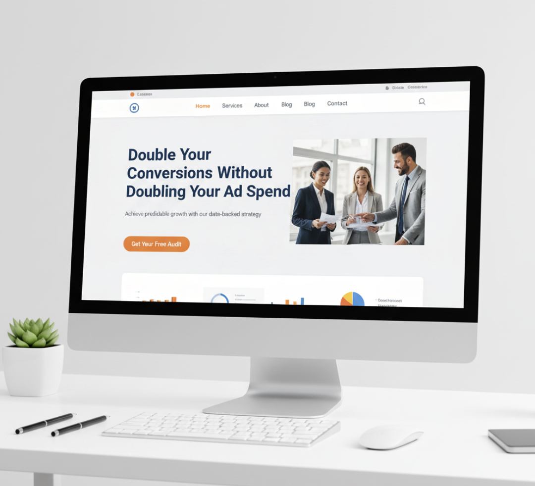
1. A Headline That Hooks Instantly
Your headline is your first impression. It should communicate value and clarity, not cleverness.
Tips:
- Focus on outcomes (“Get More Qualified Leads in 7 Days” beats “Our Services Help You Grow”)
- Use numbers or timeframes for credibility
- Mirror the visitor’s intent—if they searched for “best CRM for agencies,” echo that phrase
Example:
2. Subheadlines That Support Your Promise
The subheadline should reinforce your core message and add a layer of trust or specificity.
Example:
“Our AI-driven website audits identify and fix hidden conversion barriers in minutes.”
3. Visual Hierarchy That Guides the Eye
Your page layout should naturally direct the user toward your CTA. Use white space strategically, keep forms above the fold, and highlight your offer visually.
Checklist:
- Use a clear F-pattern or Z-pattern layout
- Keep primary CTAs in contrasting colors
- Limit distractions—avoid too many links or pop-ups
4. Social Proof and Trust Signals
People trust people. Show that others have succeeded with your solution.
Ideas for social proof:
- Client testimonials
- Logos of trusted brands
- Case studies or performance metrics
Example: “Join 2,000+ marketers who optimized their funnels with ActStrategic.ai.”
5. A Clear, Compelling Call-to-Action (CTA)
Your CTA should complete the visitor’s thought: “I want to…”
Examples:
- “Get My Free Audit”
- “See My Conversion Score”
- “Fix My Website Conversions” (link)
Make your CTA button large, high-contrast, and surrounded by breathing space.
Pro Tips for Optimizing Conversion Rates
A. Reduce Friction in Your Forms
The fewer fields you require, the higher your completion rate. Only ask for what’s essential to start a conversation.
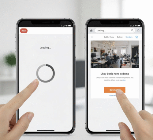
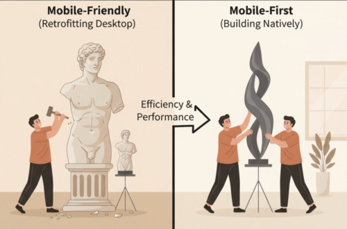
B. Make It Mobile-First
Over 60% of traffic comes from mobile. If your page doesn’t load in under 3 seconds or requires pinching and zooming, you’re losing conversions.
C. Test, Don’t Guess
Run A/B tests on headlines, button text, and page layout. Data beats assumptions every time.
Conversion Framework: The 5C Model
| C | Focus | Why It Matters |
|---|---|---|
| Clarity | Communicate one main offer | Avoid confusing choices |
| Credibility | Include proof and trust | Builds confidence |
| Consistency | Match ad to page message | Reduces bounce rate |
| Conversion | Strong CTA and UX flow | Drives action |
| Continuity | Follow-up sequence | Keeps leads engaged |
Common Landing Page Mistakes (and How to Fix Them)
- Too many CTAs: Stick to one goal per page.
- Slow loading speed: Compress images and use a CDN.
- Vague messaging: Focus on value, not features.
- Ignoring analytics: Use Google Analytics and heatmaps to measure behavior.
FAQ: Landing Page Optimization Essentials
1. What makes a landing page high-converting?
A page that quickly communicates value, builds trust, and guides users toward one clear action.
2. How many CTAs should I use?
Ideally, one—repeated in multiple places for visibility.
3. Should I include navigation menus?
No. Navigation links distract users from your main goal.
4. How can I track performance?
Use Google Analytics to monitor conversions, bounce rates, and user flow.
5. How often should I update my landing page?
Review every 3–6 months or after major campaign changes.
Final Thoughts: Your Landing Page Is a Living Asset
A great landing page isn’t built once—it evolves. Your audience, offers, and channels change, and your conversion strategy should too.
If you’re unsure why visitors aren’t converting, start with clarity. Explore ActStrategic.ai or get your Fix My Website Conversions report to identify what’s blocking growth.