
When a Great Product Isn’t Enough: The Hidden Cost of a Confusing Website
Ever felt frustrated knowing your product or service is better than competitors — but somehow, your website doesn’t reflect that? You’re not alone.
This was the exact challenge facing BrightPath Learning, an online education company that saw decent traffic but stagnant conversions. Despite having thousands of visitors each month, only a small fraction were booking demo sessions or enrolling in courses.
They didn’t have a traffic problem — they had a conversion problem.
And after a strategic website redesign powered by insights from ActStrategic.ai, they saw a 40% increase in sales within three months.
Here’s how they did it — and how you can, too.
Step 1: Diagnose the Real Problem
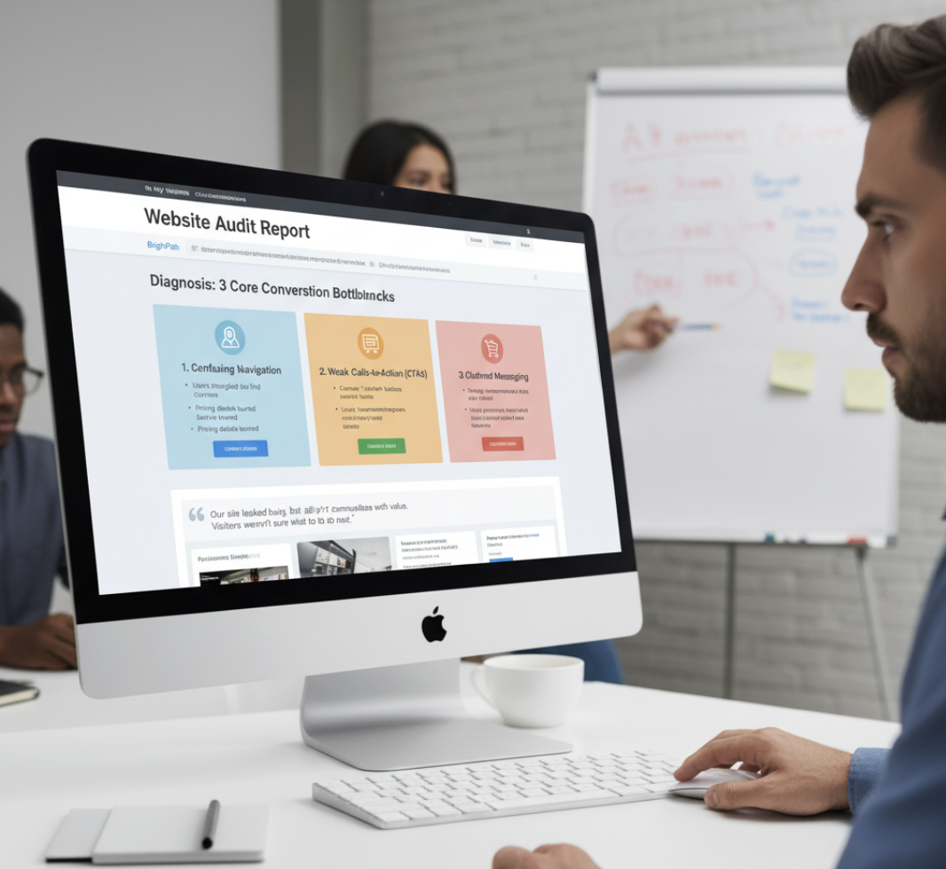
Before any redesign, the BrightPath team used the Fix My Website Conversions tool to pinpoint their biggest bottlenecks.
The analysis revealed three core issues:
- Confusing navigation: Users struggled to find course details and pricing.
- Weak calls-to-action (CTAs): Buttons like “Learn More” weren’t driving commitment.
- Cluttered messaging: The homepage tried to say everything and ended up saying nothing clearly.
“Our site looked busy, but it didn’t communicate value,” said their marketing director. “Visitors weren’t sure what to do next.”
Step 2: Redesign with User Intent in Mind
The redesign wasn’t just about new colors and fonts — it was about strategic clarity. Every change had a reason.
Key Improvements:
- Simplified navigation into 3 clear paths: Courses, Pricing, and Free Resources.
- Rewrote the homepage headline to emphasize outcomes (“Build In-Demand Skills for the AI Era”).
- Streamlined the layout to guide visitors toward a single CTA: Book a Free Trial Class.
The new design helped visitors find what they needed — and take action — faster.
Step 3: Strengthen the Calls-to-Action
CTAs are the conversion levers of your website. Weak ones create hesitation; strong ones create momentum.
BrightPath’s CTA Transformation:
| Old CTA | New CTA | Why It Worked |
|---|---|---|
| Learn More | Start My Free Trial Class | Focused on user benefit |
| Contact Us | Schedule a Free Strategy Call | Clear value proposition |
| Submit | Get My Learning Plan | Personalization adds engagement |
By making every CTA actionable, specific, and value-driven, BrightPath reduced hesitation and increased engagement.
Step 4: Optimize for Speed, Mobile, and Trust
The team discovered that 40% of users were visiting on mobile — yet load times exceeded 5 seconds.
They tackled this by:
- Compressing high-resolution images.
- Using a CDN for faster delivery.
- Simplifying the mobile layout for smoother scrolling.
Additionally, they added trust signals — testimonials, course completion stats, and student success stories.
Result? Lower bounce rates and higher mobile conversions.
Step 5: Measure, Iterate, and Scale
After launch, BrightPath didn’t stop. They monitored data using GA4 and Hotjar to refine their approach.
Metrics after 90 days:
- +40% increase in sales conversions.
- +25% more time on site.
- -32% reduction in bounce rate.
The redesign didn’t just “look better” — it performed better.
“What changed wasn’t our offer,” said the founder. “It was how clearly we communicated it.”
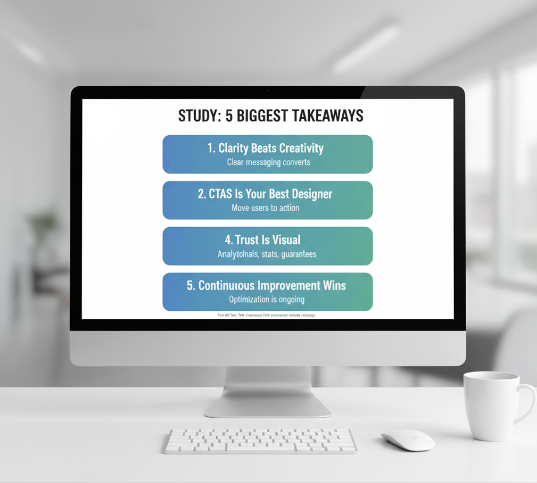
What You Can Learn from This Website Redesign Case Study
Here are the five biggest takeaways any business can apply:
- Clarity beats creativity. Fancy visuals don’t convert — clear messaging does.
- Your CTAs need purpose. Every button should move users closer to action.
- Data is your best designer. Use analytics to drive design decisions.
- Trust is visual. Testimonials, stats, and guarantees reduce friction.
- Continuous improvement wins. Optimization isn’t one-and-done — it’s ongoing.
How ActStrategic.ai Helped
Using AI-driven funnel analysis, ActStrategic.ai identified BrightPath’s hidden drop-off points — insights that human marketers often miss.
Through the Fix My Website Conversions report, BrightPath received:
- A prioritized list of conversion leaks.
- Recommended design and messaging fixes.
- Data benchmarks to track improvement.
This clarity empowered them to focus efforts where it mattered most — and scale with confidence.
FAQs About Website Redesigns and Sales Growth
1. How often should a business redesign its website?
Every 2–3 years, or sooner if analytics show declining engagement or outdated UX patterns.
2. What’s the difference between a redesign and a refresh?
A redesign changes structure and strategy; a refresh updates visuals and minor content.
3. How long does it take to see results after a redesign?
Typically 60–90 days, depending on traffic volume and testing cadence.
4. What’s the biggest mistake businesses make during redesigns?
Focusing on aesthetics over conversion strategy — design should always serve sales.
5. Do AI tools really help with website optimization?
Yes — platforms like ActStrategic.ai use data models to pinpoint friction areas and suggest evidence-backed improvements.
Final Thoughts: Design for Clarity, Convert with Confidence
A website redesign isn’t just about looking modern — it’s about aligning design with business outcomes.
When you focus on user experience, messaging clarity, and funnel flow, you transform your site from a digital brochure into a conversion engine.
If you’re ready to uncover what’s holding your conversions back, try Fix My Website Conversions — your shortcut to data-driven clarity and smarter scaling.
ActStrategic.ai — Strategic clarity for business owners who want to scale smarter.